Deepthi's Art Studio
  • Home
  • About
  • Graphic Design
  • Illustration
  • Galleries
    • Graphic Design Gallery >
      • Books and CD Cover Designs
      • Brochure Designs
      • Business Card Designs
      • Logo Designs
      • Package Designs
      • Point of Sale (POS) Designs
      • Signage Designs
    • Illustrations Gallery >
      • Graphite|Pen|Charcoal
      • Mixed Media
      • Pen and Wash
      • Watercolour|Poster Colour
      • Digital
  • Deepthi’s Books
  • Giftware
  • Special Projects
  • Contact

Illustrating a familiar landmark

2/20/2016

0 Comments

 
In my native Sinhala Language there is a saying that the comb of a rooster which is seen often appears white. Although not exactly the same idea, it is somewhat similar to the English saying, ‘familiarity begets contempt’. Recently I was forced to consider how we often take familiar sights for granted and the need to avoid this pitfall as illustrators and artists.

What led to my musings was not a sudden penchant for contemplation but the urgent necessity of an illustration brief. If you have been following my latest artwork, you will know that I am illustrating a series of memoirs for a women’s tabloid in Sri Lanka. As part of that series I had to illustrate a clock tower which is a prominent local landmark and which is described in one of the stories. 

The clock tower is located in the center of Piliyandala Town, about 10 kilometres from Colombo–the commercial capital of Sri Lanka. It was built by a philanthropist in 1953, 5 years after Sri Lanka (then known as Ceylon) gained independence from Britain. Ever since it was commissioned, the clock tower has been a prominent landmark of that area. In order to reach my mother’s native village which is situated further away from the Piliyandala town, one has to pass this clock tower. Consequently I have seen this landmark from the time I was an infant.

However, illustrating it from memory was not something I was prepared to do. This was partly because of the ‘rooster’s comb’ factor and partly because I had to illustrate the clock tower as it would have looked in the 1950’s. I had also not forgotten my late mentor Gareth Jayawardene’s exhortation to always use reference images for illustrations.

So I checked up on-line and was delighted to find a photograph of the Piliyandala clock tower taken in its early days of existence. Although it was a photograph in sepia I was familiar enough with the colouration of the clock tower over several decades. That personal knowledge was backed up by photographs taken during various periods in time which I found on-line. All these seemed to point to the fact that over the years, the colour scheme of the clock tower had not changed. Having got a good idea of the clock tower’s structural design I set to work to produce an illustration which would evoke the era described in the story.

I had decided to do this illustration in watercolour as I consider it the most suitable medium for this type of subject matter. Despite the subject matter containing straight lines I decided to take the risk of painting on a cold pressed watercolour paper. I use the word ‘risk’ because the rough surface of the paper does not lend itself easily to the smooth painting of straight lines. However I preferred to concentrate on the fact that the paper would help to bring out a more tangible feel of the clock tower’s surface.
Watercolour illustration of the clock tower at Piliyandala Town in Sri Lanka by Deepthi Horagoda
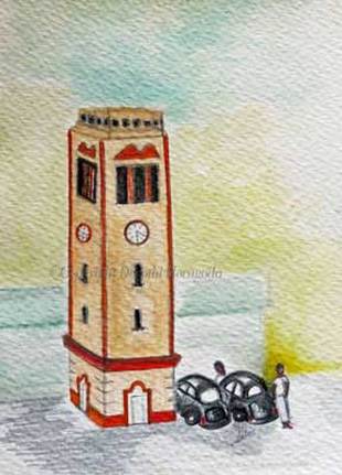
The Piliyandala Town's clock tower as it would have looked in the 1950’s.
​Looking at the final result I feel my decision has helped to achieve the desired effect.
​This is true of not only the clock tower but also the nearby building and the tarred road. Deciding on what was most important in the final look of the illustration helped me to reproduce on paper what I had in mind. Had I been less focused on the final outcome, the minor hassles of painting on the rough surface of the paper would have distracted me. Hopefully I will remember that when selecting paper for my next illustration project!
0 Comments

Illustrating a four-legged hero

2/9/2016

0 Comments

 
Here are my latest illustrations from the series of stories published in the Navaliya women’s weekly magazine. This week’s story was about a canine hero who saved one of my mother’s younger sisters when she fell into their bathing pond.

My job of illustrating the bathing pond and my grandfather featured in the story was made easier due to the fact that I was familiar with their appearance. As for illustrating the dog who happened to be the main ‘star’ of the story, it was not so difficult as I was told that it was a rice hound. They are by far the most common breed of dogs here in Sri Lanka and due to their smooth coat, quite easy to illustrate.
a mixed media illustration by deepthi horagoda of a dog rescuing a child who has fallen into a bathing pond
In the illustration above, you can see our canine hero in action. I used an A5 size medium grain cartridge paper by Artifolk which although only 160gsm in weight can withstand quite a heavy wash. This is due to the fact that the paper is made partly out of cotton. I love to work on this paper, especially with my waterbrushes. In fact, several illustrations for my mother’s first book of childhood memoirs were done using this same paper.

​As for the colours, they are a variety of mixed media with watercolours predominating the illustration. The cemented floor and the bucket in the foreground were done using Derwent’s water soluble graphite pencils. Since I was a bit pressed for time I added a pale orange gradient to create the background using Photoshop Elements.
mixed media illustration of a sri lankan rice hound dog
There was another aspect of the story which I wanted to highlight through the illustrations. I have noticed that unlike humans, dogs don’t seem to demand attention for their good work after the deed is done. Personally I think this is a quality which makes dogs such endearing creatures.

​Having known quite a lot of dogs—including the ones who lived at my grandparents’ home—I did not have to think long and hard about the type of pose required. All I had to do was to draw a pose which reflected an ’all in a day’s work’ attitude. 

For this illustration of the rice hound relaxing I used a cold pressed thick watercolour paper as I needed to apply several washes of brown. I started with a very light wash of sepia ink. Thereafter I used darker shades of brown (watercolour as well as Derwent’s Inktense blocks) for the different areas of the dog’s body. For the shadows I used a dark grade of Derwent’s water soluble graphite pencils. 

Of course, the final test for an illustration of a story is the author’s reaction to it. As for the illustration above I found out the easy way. When my mother popped in to ask me something she saw the illustration I had just finished and exclaimed, “That’s exactly what our dogs looked like”! Needless to say I was thrilled...
0 Comments

    From my sketchbooks...

    To see how some of
    my latest artwork evolved, take a look at my sketchbooks > 

    Archives

    April 2017
    April 2016
    March 2016
    February 2016
    January 2016
    December 2015
    July 2015
    February 2015
    January 2015

    RSS Feed

Powered by Create your own unique website with customizable templates.