
| My latest illustrations for the Navaliya Women’s Weekly found me focused on the eco-friendly culinary utensils and habits of Sri Lankans in the past. As in other countries blessed with coconut palms, Sri Lankans have been using various parts of the palms in their daily lives for millennia. One place in households where this is evident even today is the kitchen. For it is a rare house where one would not find at least a spoon or two made out of coconut shells, not to mention brooms made of coconut coir. What’s more, if there is a garden, a broom made of ekels is a must for sweeping leaves. However, what sets apart those who lived 50 or 60 years ago is that the majority of them made their own utensils. This was the aspect which the author (my mother) had written about in one of the stories which I illustrated. Her story not only draws attention to the consummate skill of the average villager of a bygone era but also describes eloquently how nothing was wasted. | An excellent example of this ‘waste not, want not attitude’ which I illustrated was a container for salt crystals. In former times, salt used to be sold only in crystal form. Whenever one needed fine grains of salt, a few crystals would be ground and used, whereas the rest was kept stored. It was a common practice to use a cleaned half-coconut shell for this purpose. It was after all, quick and easy, plus replaceable. However, in my mother’s extended family, her paternal grandfather took a more considered and refined approach in making a salt container for his daughter-in-law. Not only was the appearance more elegant and health-conscious but also a prize example of not wasting a natural resource. The container was made out of a tender coconut which would sometimes get plucked by mistake. The flesh of such a coconut being not mature enough for use in making |
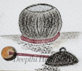
| curries would be considered useless by an ordinary housewife. My great-grandfather, however saw the potential in using such a coconut, not only in consuming the coconut water but also in finally creating a container with a lid. Not stopping with that, he would then fashion out a holder for placing the container as well. It was made out of a piece of a coconut branch dried in the sun and bound closely with coir rope which he himself had extracted from coconut husks, beaten and rolled. Having considered the subject matter of the required illustrations I decided to use a cold pressed watercolour paper. The rough, uneven texture helped to reproduce the natural look of the | coconut shell products. I drew the coconut shell parts with a Derwent tinted charcoal pencil which is my firm favourite for this type of work. The salt crystals were done with a little help from my Derwent silver pencil. The pencil gave me just the right hint of colour to bring out the distinctive shapes of the crystals by playing with the raised texture of the watercolour paper. The inner side of the spoon was done with a light wash of watercolour. The handle and the container holder was done with my trusty MG erasable gel pen. Apart from the fact that the ink is vibrant and I can ‘undo’ if I get a stray line or two I love the fact that I can |
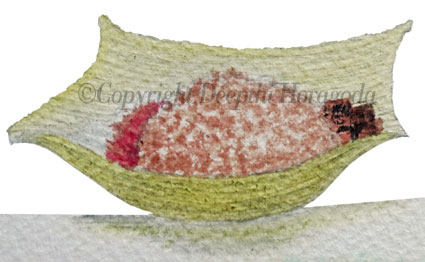
| buy refills without polluting the environment. Sadly, here in Sri Lanka we do not have a system in place whereby discarded ball point pens could be collected and the plastic recycled. My mother has written about this need in the past to the authorities but to no avail. I suppose we will have to keep on trying! Still on the subject of eco-friendly culinary practices of Sri Lankans in the past I got the opportunity to illustrate a typical take-away food container as well. Imagine the number of interested consumers if a seller were to advertise this product in the following manner:‘A combined wrapper and container with built-in insulation to keep food fresh for hours. What’s more it’s one hundred percent environmentally-friendly!’ A generation or two ago, most Sri Lankan villagers used the casing of an arecanut palm’s inflorescence to wrap up and take a meal of rice and curry with them when travelling. Back then, fast-food and snack bars did not exist and people were wary of eating food not cooked at home. Since the easily available arecanut palm inflorescence had all the earlier-mentioned advantages, housewives did not have to worry about containers. It was convenient for the traveller as well, since the ‘wrapper’ could be discarded and the environment was none the worse for it. Now here again I had to consider carefully the best art materials and media for illustrating the subject. Arecanut inflorescence casings are generally either dark beige or pale yellow in colour. they have a distinctive texture, with grooved ridges running from one end to the other. In order to render the illustration as realistically as possible I had to reproduce the ridged effect, as well as the rough texture. Apart from the casing I had to illustrate grains of cooked brown rice which tend to contain splotches of white as well. | So bearing those factors in mind I used a cold pressed watercolour paper. Before beginning to apply the watercolours I used an embossing tool made by Derwent to score the ridged lines (see it in the bird’s illustration in my sketchbook). I also ran the tool over the outlines of my drawing, something which really helped in the final outcome as I will describe eventually. When I began to spread a light wash of yellow I could sense the subject matter coming through. I was thrilled, especially since watercolours are hardly renowned for behaving as artists would like. At the same time it proved that marking the outlines of the illustration with the embossing tool was a good idea, as it prevented the colours from running beyond the boundaries of the illustration. Along with that, the ridges began to appear just as I wanted them. This is a technique I learned from that wonderful book by Claudia Nice titled Painting with Watercolor, Pen and Ink. The indentations of the watercolour paper’s rough surface also worked well with the grains of rice which I painted, enabling me to dab bits of brown here and there, leaving the rest white. Not only did it create a realistic look but saved me lots of time as well. By illustrating these facets of the lifestyle of a past era I try to draw the attention of the ladies reading my mother’s stories to natural and cheap resources we have at hand. At a time when the world’s resources are limited, back-to-basics thinking is becoming a must. I am happy to state that our efforts have been commended by readers. In fact, several have told my mother that they have literally thrown out various artificial products in favour of eco-friendly alternatives suggested by her. Now what could be more rewarding than that? |
 RSS Feed
