Deepthi's Art Studio
  • Home
  • About
  • Graphic Design
  • Illustration
  • Galleries
    • Graphic Design Gallery >
      • Books and CD Cover Designs
      • Brochure Designs
      • Business Card Designs
      • Logo Designs
      • Package Designs
      • Point of Sale (POS) Designs
      • Signage Designs
    • Illustrations Gallery >
      • Graphite|Pen|Charcoal
      • Mixed Media
      • Pen and Wash
      • Watercolour|Poster Colour
      • Digital
  • Deepthi’s Books
  • Giftware
  • Special Projects
  • Contact

Another first in publishing in Sri Lanka...

4/22/2017

0 Comments

 
My mother’s latest book is the first cookery book for children published in Sri Lanka. It was written due to a special request by the Directress of a Montessori.

The entire book had to be designed attractively yet simply. I suggested that we highlight the magical nature of cooking. Once that idea was approved, the design aspects took shape fairly quickly. The cover illustration was hand drawn and coloured using a combination of colour pencils, watercolour pencils and gel pen. For the background I used a shade of the colour of magic—purple. The photographs of the dishes on the cover were selected according to 2 criteria: they had to represent the wide range and colours of the dishes within.
front cover of sri lanakan cooking magic for kids by beeta rajapaksha
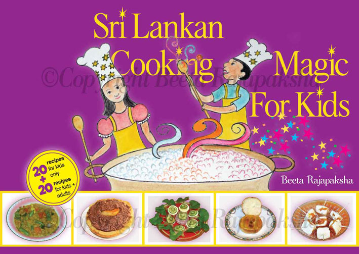
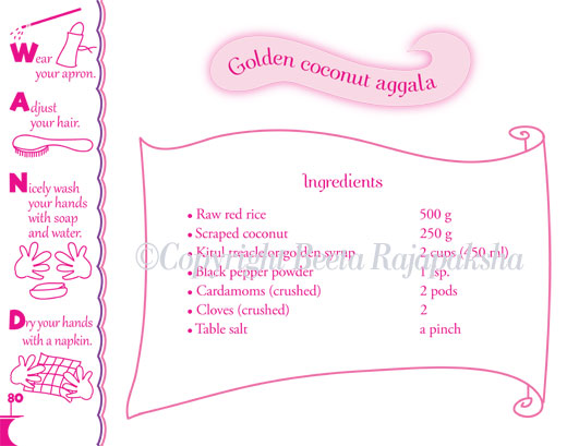
We decided that each recipe should begin with a simple prep drill. I incorporated the magical element into it by creating the mnemonic ‘WAND’. To aid young readers I drew simple illustrations which spelled out WAND visually. Repetition and structure are vital aspects in early childhood learning. I was mindful of these points when I designed the page layouts. Consequently, all 40 recipes were presented using the same layout. To differentiate the recipes which required an adult’s assistance I used a different colour.
design of a preparation page from sri lankan cooking magic for kids by beeta rajapaksha
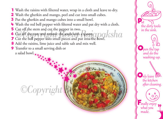
We also wanted to train children to clean up the kitchen after cooking. Once again I used a magical element and another mnemonic—POOF. This was designed to complement the WAND mnemonic on the facing page. I sent a sample of the pages to the Montessori Directress. Her feedback was very positive and also appreciative.

Apart from designing the book I had to test the recipes as well. Thereafter, the results had to photographed for inclusion in the book. Once again I incorporated the idea of magic by including a trail of stars.
design of an instruction page from sri lankan cooking magic for kids by beeta rajapaksha
Enquiries confirmed that a second edition in our native language would be required. I was mindful of this factor whilst designing the book. The design was done to enable the re-use of printing plates wherever possible. Likewise, using only 2 process colours for approximately half of the book reduced costs. Consequently, the artwork of the Sinhala language edition was ready within 2 weeks.

The books were out on sale 2  1/2 weeks later. The timing was perfect as it was the week before our traditional New Year. It is a period when families are busy preparing traditional sweetmeats. Unfortunately, most children end up as spectators since cooking on stoves is deemed dangerous. Hopefully, our new book was just what they needed to break the spell!
0 Comments

Queen Elizabeth II in 1952

4/28/2016

1 Comment

 
Whilst the whole world was focused on the 90th birthday of HRH Queen Elizabeth II, my mother’s weekly column of recollections was about the Queen’s visit to Ceylon, aged 28. That historical visit through some coincidence also took place in April, just 2 years after her coronation in 1952. Although Ceylon achieved independence from Great Britain in 1948, it was still a Dominion State and part of the Commonwealth of Nations. Hence, the first-ever visit by the young queen created tremendous interest among the Ceylonese. My mother who was 11+ at the time was taken along by her mother to Colombo city to ‘see the Queen’ as she drove past in an open car. 

However, that was only a part of the story, as my mother goes on to describe how the images of the Queen were omni-present during her childhood. Since Queen Elizabeth’s coronation took place in 1952, most consumer goods imported from the UK at the time had included portraits of the new queen. These had ranged from porcelain tea sets and umbrellas to biscuit tins and calendars. I found it both amusing and exasperating that some people had even framed the portrait of the queen which had been printed on calendars and hung on the walls in their homes. So much for national independence gained just 4 years earlier!

My task of course was to illustrate a suitable part of the story. Obviously, researching images of the Queen’s visit was a must. It didn’t take me long to find an old newsreel clip of the event filmed in black and white which had been uploaded on-line. However, after considering that the story was to be published in a women’s weekly and also the Queen’s impending birthday celebrations I decided not to illustrate the historical event per se. Instead I decided to portray the Queen as she would have appeared on a biscuit tin designed to commemorate her coronation in 1952. I felt that since most of the readers of the story would not have seen Queen Elizabeth II in her younger years, my illustration would be a focal point.

Once again, searching on-line proved fruitful as I was able to source several images of biscuit and confectionery tins produced to commemorate the coronation in 1952. Armed with these for reference I set to work to create a likeness to Her Majesty.

At the very outset I decided to restrict myself to coloured pencils for this particular illustration. Art materials-wise it was an Anglo-German combination: Staedtler watercolour pencils and Faber Castell Polychromos pencils from Germany on Artifolk cartridge paper from the UK. Here is the result:
Illustration of Queen Elizabeth II
​You can view some work-in-progress images of the illustration in my sketchbooks page. I would like to think that Her Majesty would have been amused if she saw this portrait of herself...
1 Comment

Illustrating a fast-fading lifestyle 

4/10/2016

0 Comments

 
“The power of an illustration to inspire, instruct and inform cannot be over-stated.”

The above quote is mine but I have become more and more convinced of its truth as
I continue to illustrate aspects of village life in the 1950s in Ceylon. My mother’s recent story in her weekly newspaper series was about the preparations for the traditional new year at her childhood home.

Since the traditional new year in Sri Lanka is centered around the rice paddy harvest and
the cooking of the first meal using newly harvested rice, housewives play a key role. Needless to say, the kitchen and all that is connected with it receive a ‘spring cleaning’— even though our tropical climate has no spring season as such.

​The advent of the traditional new year is calculated according to astrology and all key
rituals associated with the day are carried out according to auspicious times. Out of these events, the lighting of the hearth to cook the first meal in the new year is of paramount importance. The very first act in this regard is to boil a pot of milk until it overflows slightly, thereby symbolizing the hopes for a year overflowing with prosperity. Thereafter, a pot of milk rice is cooked as the first meal. An earthenware pot is traditionally used for this all-important occasion—a new pot being used each year. Needless to say, the purchasing of
a suitable pot is high on the list of priorities of all housewives, even in the 21st Century.

One can imagine the hassles involved in going to a village fair to purchase earthenware
pots and bringing them home in one piece before the advent of modern roads. However, there had been travelling tradesmen who brought earthenware pots to the homes of farmers, sparing the womenfolk of the trouble of going ‘shopping’. It was this subject which I had to illustrate a few weeks ago.
A pingo containing clay pots illustrated by Deepthi Horagoda
The pots were carried in two huge rattan baskets fixed with ropes to a horizontal wooden pole. Known as a pingo, this contraption was carried on the tradesman’s shoulder. Apart from earthenware, pingos have been used for carrying various produce such as vegetables, fruits and fish. Indeed, fish vendors carrying fish on pingos can still be seen even in cities. However, they are getting replaced by faster modes of transportation such as scooters, even in rural areas. Although slow and physically laborious, pingos  are an eco-friendly means of transport from a simpler and leisurely era. 

I ended up using several different media for this illustration—something which happens quite often. For the horizontal pole I used Derwent tinted charcoal atop a light wash of brown watercolour. The ropes and woven effects of the basket were done using a gel pen, whilst the pots and straw were done using watercolours. As usual, using a slightly rough textured watercolour paper helped to bring out the crude appearance of the subject matter.

Hopefully, illustrations such as the one I have done will enable future generations to learn about facets of the lifestyle of bygone times...
0 Comments

The right tool for the right job:then and now

3/21/2016

0 Comments

 
My latest illustrations for the Navaliya Women’s Weekly found me focused on the eco-friendly culinary utensils and habits of Sri Lankans in the past. As in other countries blessed with coconut palms, Sri Lankans have been using various parts of the palms in their daily lives for millennia. One place in households where this is evident even today is the kitchen. For it is a rare house where one would not find at least a spoon or two made out of coconut shells, not to mention brooms made of coconut coir. What’s more, if there is a garden, a broom made of ekels is a must for sweeping leaves.

However, what sets apart those who lived 50 or 60 years ago is that the majority of them made their own utensils. This was the aspect which the author (my mother) had written about in one of the stories which I illustrated. Her story not only draws attention to the consummate skill of the average villager of a bygone era but also describes eloquently how nothing was wasted. 
​An excellent example of this ‘waste not, want not attitude’ which I illustrated was a container for salt crystals. In former times, salt used to be sold only in crystal form. Whenever one needed fine grains of salt, a few crystals would be ground and used, whereas the rest was kept stored. It was a common practice to use a cleaned half-coconut shell for this purpose. It was after all, quick and easy, plus replaceable. However, in my mother’s extended family, her paternal grandfather took a more considered and refined approach in making a salt container for his daughter-in-law.

Not only was the appearance more elegant and health-conscious but also a prize example of not wasting a natural resource. The container was made out of a tender coconut which would sometimes get plucked by mistake. The flesh of such a coconut being not mature enough for use in making 
Mixed media illustrations of kitchen utensils made from coconut shells
curries would be considered useless by an ordinary housewife. My great-grandfather, however saw the potential in using such a coconut, not only in consuming the coconut water but also in finally creating a container with a lid. Not stopping with that, he would then fashion out a holder for placing the container as well. It was made out of a piece of a coconut branch dried in the sun and bound closely with coir rope which he himself had extracted from coconut husks, beaten and rolled.

Having considered the subject matter of the required illustrations I decided to use a cold pressed watercolour paper. The rough,
uneven texture helped to reproduce the natural look of the  
coconut shell products. I drew the coconut shell parts with a Derwent tinted charcoal pencil which is my firm favourite for this type of work. The salt crystals were done with a little help from my Derwent silver pencil. The pencil gave me just the right hint of colour to bring out the distinctive shapes of the crystals by playing with the raised texture of the watercolour paper. The inner side of the spoon was done with a light wash of watercolour.

​The handle and the container holder was done with my trusty MG erasable gel pen. Apart from the fact that the ink is vibrant and I can ‘undo’ if I get a stray line or two I love the fact that I can
Watercolour illustration of an eco-friendly food wrapper known as a 'kolapatha'
buy refills without polluting the environment. Sadly, here in Sri Lanka we do not have a system in place whereby discarded ball point pens could be collected and the plastic recycled. My mother has written about this need in the past to the authorities but to no avail. I suppose we will have to keep on trying!

Still on the subject of eco-friendly culinary practices of Sri Lankans in the past I got the opportunity to illustrate a typical take-away food container as well. Imagine the number of interested consumers if a seller were to advertise this product in the following manner:‘A combined wrapper and container with built-in insulation to keep food fresh for hours. What’s more it’s one hundred percent environmentally-friendly!’  A generation or two ago, most Sri Lankan villagers used the casing of an arecanut palm’s inflorescence to wrap up and take a meal of rice and curry with them when travelling. Back then, fast-food and snack bars did not exist and people were wary of eating food not cooked at home. Since the easily available arecanut palm inflorescence had all the earlier-mentioned advantages, housewives did not have to worry about containers. It was convenient for the traveller as well, since the ‘wrapper’ could be discarded and the environment was none the worse for it. 

​Now here again I had to consider carefully the best art materials and media for illustrating the subject. Arecanut inflorescence casings are generally either dark beige or pale yellow in colour. they have a distinctive texture, with grooved ridges running from one end to the other. In order to render the illustration as realistically as possible I had to reproduce the ridged effect, as well as the rough texture. Apart from the casing I had to illustrate grains of cooked brown rice which tend to contain splotches of white as well.
​So bearing those factors in mind I used a cold pressed watercolour paper. Before beginning to apply the watercolours I used an embossing tool made by Derwent to score the ridged lines (see it in the bird’s illustration in my sketchbook). I also ran the tool over the outlines of my drawing, something which really helped in the final outcome as I will describe eventually.

When I began to spread a light wash of yellow I could sense the subject matter coming through. I was thrilled, especially since watercolours are hardly renowned for behaving as artists would like. At the same time it proved that marking the outlines of the illustration with the embossing tool was a good idea, as it prevented the colours from running beyond the boundaries of the illustration. Along with that, the ridges began to appear just as I wanted them. This is a technique I learned from that wonderful book by Claudia Nice titled Painting with Watercolor, Pen and Ink.

The indentations of the watercolour paper’s rough surface also worked well with the grains of rice which I painted, enabling me to dab bits of brown here and there, leaving the rest white. Not only did it create a realistic look but saved me lots of time as well.

By illustrating these facets of the lifestyle of a past era I try to draw the attention of the ladies reading my mother’s stories to natural and cheap resources we have at hand. At a time when the world’s resources are limited, back-to-basics thinking is becoming a must. I am happy to state that our efforts have been commended by readers. In fact, several have told my mother that they have literally thrown out various artificial products in favour of eco-friendly alternatives suggested by her. Now what could be more rewarding than that?
0 Comments
<<Previous

    From my sketchbooks...

    To see how some of
    my latest artwork evolved, take a look at my sketchbooks > 

    Archives

    April 2017
    April 2016
    March 2016
    February 2016
    January 2016
    December 2015
    July 2015
    February 2015
    January 2015

    RSS Feed

Powered by Create your own unique website with customizable templates.