Deepthi's Art Studio
  • Home
  • About
  • Graphic Design
  • Illustration
  • Galleries
    • Graphic Design Gallery >
      • Books and CD Cover Designs
      • Brochure Designs
      • Business Card Designs
      • Logo Designs
      • Package Designs
      • Point of Sale (POS) Designs
      • Signage Designs
    • Illustrations Gallery >
      • Graphite|Pen|Charcoal
      • Mixed Media
      • Pen and Wash
      • Watercolour|Poster Colour
      • Digital
  • Deepthi’s Books
  • Giftware
  • Special Projects
  • Contact

The challenges and delights of illustrating with black

3/6/2016

0 Comments

 
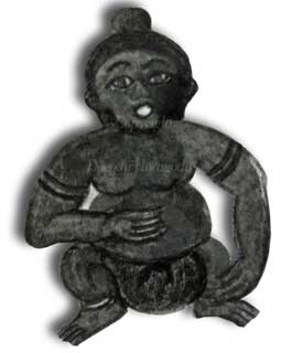
When Henry Ford famously said, “You can have any colour you like as long as it’s black” referring to the Model T Ford, he probably did not know much about black. Last week’s illustration work for the newspaper series made me consider what a complex colour black can be—depending on what one is illustrating. 

By some strange coincidence, both the illustrations for my mother’s recollections of a childhood pilgrimage had to be rendered in black. One was a statue of a demon whilst the other was a much more ‘cute’ subject in the form of a Malabar Pied Hornbill.

Drawing the statue of the demon was not exactly easy as I had to rely on several sources and combine them. I have seen many statues of demons at both Buddhist temples and Hindu shrines. However, the demon which is described in the story is a mechanical type of statue.

​According to my mother’s narrative, the statue was actually a till. It was designed in such a way that the ‘demon’ held one palm open upwards, whilst the mouth was also open. When a coin was placed on the palm and a lever fixed behind the statue was pulled down, the ‘demon’ would pop the coin into its mouth. Needless to say, my mother and her siblings were delighted by the novel sight, referring to the statue as the ‘money-swallowing demon’.

My mother told me that the statue had a rough appearance and finish, unlike the statues commonly seen today. So I decided to use a cold pressed water colour paper with mainly charcoal to produce the darker shades. I began by using a medium-grade Derwent water soluble graphite pencil to colour the areas of the drawing which had to be light. Thereafter I used a slightly damp waterbrush to obtain a washed effect as I felt the statue should reflect a somewhat weather-beaten look. For the darker areas I used charcoal.

Having got the demon to resemble what my mother described I added a shadow effect in Photoshop Elements. This added a 3 D look to the illustration as you can see in the image below:
Illustration of a demon done in graphite, charcoal and ink
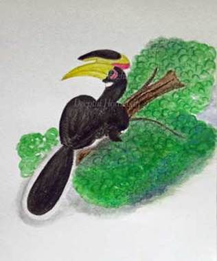
The rough surface of the cold pressed watercolour paper is not very conducive for drawing smooth lines. I foresaw this problem before
​I began the illustration. However I was not particularly worried about crooked lines as I used an erasable black pen. Planning what media and tools to use before illustrating can save a lot of frustration and time—especially when deadlines are looming.

The second illustration which was of a Malabar Pied Hornbill got me thinking on the different instances of black in nature. Having watched several YouTube videos of these eccentric-looking birds I wanted to reproduce the rich fluffiness of their black feathers.

After considering several media, including black drawing ink I finally decided to use my black Derwent Inktense block. I am glad I did as it helped me to achieve the vibrancy I wanted without the mess which can happen when using ink. The rest of the illustration was a mix of water soluble brown charcoal as well as Inktense and watercolours.  
Mixed media illustration of Malabar pied hornbill
You can see the above illustration in progress in my sketchbooks. I should also mention that I used Artifolk’s cartridge paper for this mixed media illustration. 

When I began these illustrations I was somewhat worried as to how the different values of black would be reproduced on newsprint. I need not have worried, though. The illustrations were reproduced very well, proving there is more to black than what caught Mr.Ford’s eye...
0 Comments

Illustrating a familiar landmark

2/20/2016

0 Comments

 
In my native Sinhala Language there is a saying that the comb of a rooster which is seen often appears white. Although not exactly the same idea, it is somewhat similar to the English saying, ‘familiarity begets contempt’. Recently I was forced to consider how we often take familiar sights for granted and the need to avoid this pitfall as illustrators and artists.

What led to my musings was not a sudden penchant for contemplation but the urgent necessity of an illustration brief. If you have been following my latest artwork, you will know that I am illustrating a series of memoirs for a women’s tabloid in Sri Lanka. As part of that series I had to illustrate a clock tower which is a prominent local landmark and which is described in one of the stories. 

The clock tower is located in the center of Piliyandala Town, about 10 kilometres from Colombo–the commercial capital of Sri Lanka. It was built by a philanthropist in 1953, 5 years after Sri Lanka (then known as Ceylon) gained independence from Britain. Ever since it was commissioned, the clock tower has been a prominent landmark of that area. In order to reach my mother’s native village which is situated further away from the Piliyandala town, one has to pass this clock tower. Consequently I have seen this landmark from the time I was an infant.

However, illustrating it from memory was not something I was prepared to do. This was partly because of the ‘rooster’s comb’ factor and partly because I had to illustrate the clock tower as it would have looked in the 1950’s. I had also not forgotten my late mentor Gareth Jayawardene’s exhortation to always use reference images for illustrations.

So I checked up on-line and was delighted to find a photograph of the Piliyandala clock tower taken in its early days of existence. Although it was a photograph in sepia I was familiar enough with the colouration of the clock tower over several decades. That personal knowledge was backed up by photographs taken during various periods in time which I found on-line. All these seemed to point to the fact that over the years, the colour scheme of the clock tower had not changed. Having got a good idea of the clock tower’s structural design I set to work to produce an illustration which would evoke the era described in the story.

I had decided to do this illustration in watercolour as I consider it the most suitable medium for this type of subject matter. Despite the subject matter containing straight lines I decided to take the risk of painting on a cold pressed watercolour paper. I use the word ‘risk’ because the rough surface of the paper does not lend itself easily to the smooth painting of straight lines. However I preferred to concentrate on the fact that the paper would help to bring out a more tangible feel of the clock tower’s surface.
Watercolour illustration of the clock tower at Piliyandala Town in Sri Lanka by Deepthi Horagoda
The Piliyandala Town's clock tower as it would have looked in the 1950’s.
​Looking at the final result I feel my decision has helped to achieve the desired effect.
​This is true of not only the clock tower but also the nearby building and the tarred road. Deciding on what was most important in the final look of the illustration helped me to reproduce on paper what I had in mind. Had I been less focused on the final outcome, the minor hassles of painting on the rough surface of the paper would have distracted me. Hopefully I will remember that when selecting paper for my next illustration project!
0 Comments

Illustrating a four-legged hero

2/9/2016

0 Comments

 
Here are my latest illustrations from the series of stories published in the Navaliya women’s weekly magazine. This week’s story was about a canine hero who saved one of my mother’s younger sisters when she fell into their bathing pond.

My job of illustrating the bathing pond and my grandfather featured in the story was made easier due to the fact that I was familiar with their appearance. As for illustrating the dog who happened to be the main ‘star’ of the story, it was not so difficult as I was told that it was a rice hound. They are by far the most common breed of dogs here in Sri Lanka and due to their smooth coat, quite easy to illustrate.
a mixed media illustration by deepthi horagoda of a dog rescuing a child who has fallen into a bathing pond
In the illustration above, you can see our canine hero in action. I used an A5 size medium grain cartridge paper by Artifolk which although only 160gsm in weight can withstand quite a heavy wash. This is due to the fact that the paper is made partly out of cotton. I love to work on this paper, especially with my waterbrushes. In fact, several illustrations for my mother’s first book of childhood memoirs were done using this same paper.

​As for the colours, they are a variety of mixed media with watercolours predominating the illustration. The cemented floor and the bucket in the foreground were done using Derwent’s water soluble graphite pencils. Since I was a bit pressed for time I added a pale orange gradient to create the background using Photoshop Elements.
mixed media illustration of a sri lankan rice hound dog
There was another aspect of the story which I wanted to highlight through the illustrations. I have noticed that unlike humans, dogs don’t seem to demand attention for their good work after the deed is done. Personally I think this is a quality which makes dogs such endearing creatures.

​Having known quite a lot of dogs—including the ones who lived at my grandparents’ home—I did not have to think long and hard about the type of pose required. All I had to do was to draw a pose which reflected an ’all in a day’s work’ attitude. 

For this illustration of the rice hound relaxing I used a cold pressed thick watercolour paper as I needed to apply several washes of brown. I started with a very light wash of sepia ink. Thereafter I used darker shades of brown (watercolour as well as Derwent’s Inktense blocks) for the different areas of the dog’s body. For the shadows I used a dark grade of Derwent’s water soluble graphite pencils. 

Of course, the final test for an illustration of a story is the author’s reaction to it. As for the illustration above I found out the easy way. When my mother popped in to ask me something she saw the illustration I had just finished and exclaimed, “That’s exactly what our dogs looked like”! Needless to say I was thrilled...
0 Comments

When One Set of Illustrations Lead to Another...

1/31/2016

0 Comments

 
About a month ago, the editor of the Navaliya, a popular local women’s weekly tabloid who saw my mother's book of childhood memoirs ’phoned me. He said that he was highly impressed by my mother’s stories as well as my illustrations.

According to him, my illustrations are the best he has seen to-date which are comparable to those by Mrs.Sybil Wettasinghe—the leading illustrator of children’s books in Sri Lanka. I consider it a huge compliment, given the fact that my work was compared to an illustrator who counts over 50 years of experience.

As if that was not enough, the editor requested my mother to contribute unpublished stories of her childhood to be serialized in the women’s weekly. 
There was one condition, though: the editor wanted me to illustrate all the stories.

So I have been kept busy illustrating a fascinating variety of subject matter—yet again. Among them are various forms of wildlife, including a porcupine and a mouse-deer (chevrotain) as well as a snake-head fish (Channa striata). I have also had the honour of re-creating a likeness of my maternal great-grandfather whom I have not seen even in a photograph. My single source of information is my mother who was around 23 years old when her grandfather passed away, aged around 102 years.

So far it has been an interesting journey. The very first story in the series was published on the 25th of January. This is the illustration of the mouse-deer which appeared in that issue:
Mixed media illustration of a mouse-deer by deepthi horagoda
It is a mixed media illustration on cold-pressed watercolour paper. I used Derwent Inktense blocks and Staedtler watercolour pencils, as well as Derwent tinted charcoal and water soluble graphite pencils. 

​​The second one which incidentally will contain an illustration of my great-grandfather will be published the week thereafter. I thought of sharing that illustration here:
Watercolour illustration by deepthi horagoda of picking up wasted rubber latex in ceylon
The figure on the left side in the foreground is my great-grandfather. I am sure you are wondering as to what this illustration is about, It is part of a story where my mother relates how she and her siblings got into the habit of earning some money as well as saving. 

Their grandfather would visit the rubber plantations surrounding their home and collect all the latex which had overflowed the collection containers. The ‘containers’ were large, cleaned coconut shells which had been halved. Sometimes, the latex would overflow them and congeal on the ground. They would then become a black, sticky mass. These could be collected, cleaned of any sticks, stones or leaves sticking to them and sold for a moderate amount. When the market price of processed rubber increased, the latex picked off the rubber estate ground also received a higher price.

​When my mother’s grandfather set off to pick the overflowed latex, my mother and her siblings would accompany him and help. Once he sold the latex, my mother and her siblings were given a part of the income which they gleefully put into their saving tills. 

It is this recollection which I have illustrated in the image above. I used a watercolour paper with a rough surface which I felt would be ideal to reproduce the bark of the rubber trees. For this illustration, apart from watercolours I also used a Derwent tinted charcoal pencil. I used a muted palette of colours since rubber plantations are generally rather gloomy due to the overhead canopy of foliage formed by the leaves of the trees.

I will be posting the rest of the illustrations of the stories on a weekly basis. So don’t forget to check here in another 7 days’ time.
0 Comments
<<Previous
Forward>>

    From my sketchbooks...

    To see how some of
    my latest artwork evolved, take a look at my sketchbooks > 

    Archives

    April 2017
    April 2016
    March 2016
    February 2016
    January 2016
    December 2015
    July 2015
    February 2015
    January 2015

    RSS Feed

Powered by Create your own unique website with customizable templates.